Catalog Relaunch for the Selecta Group
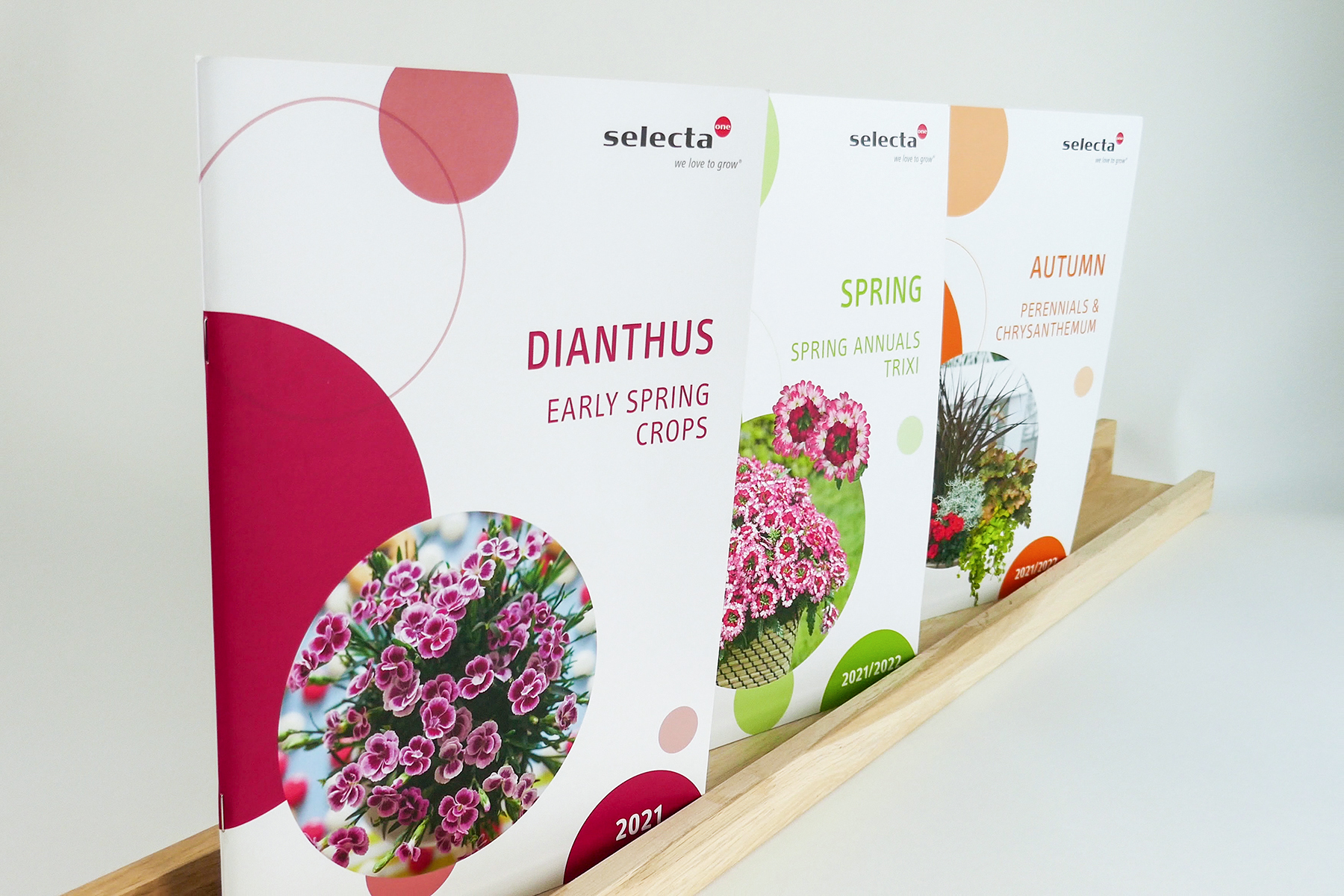
A well-known name in the green industry, the Selecta Group, is a global leader in the breeding, production, and marketing of innovative ornamental and edible plants. Floramedia and Selecta have maintained a long-standing partnership based on mutual respect, collaborating in many areas such as catalogs, magazines, labels, and other promotional materials – not only in Germany with Selecta Stuttgart but also with Selecta International.
A brand-new catalog that stands out from the crowd
In 2020, Selecta made the decision to completely relaunch the layout of their catalogs in order to stand out from their competitors with a fresh new look. A modern, innovative, and customer-friendly design was particularly important for the redesign. This presented a significant challenge for the Floramedia team, as Selecta serves many different markets with varying needs, all of which had to be addressed within one catalog. Additionally, the project began with a "blank slate," as there were no specific ideas regarding how the new design should look. Speaking of a "blank slate," there was also a major change in the materials used, as not only the appearance was refined, but production was intentionally shifted toward greater sustainability. The goal was to find paper that was more environmentally friendly without compromising on image quality. Another focus was restructuring the product range for better usability and to meet the demands of sales.
Step by Step to the Brand New Catalog
Step 1: Workshop
Essential for the relaunch was finding a common foundation on which the new design could be built. During a one-day workshop, not only were the competitors closely examined, but the various sections of the catalog were also analyzed in detail. By discussing three different layouts, a direction was established to fill the blank slate. Thanks to the personal and constructive exchange between the teams, the "Relaunch" project reached its first major milestone.
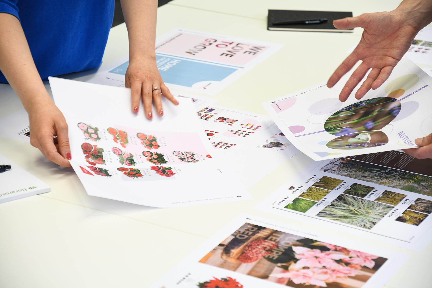
Step 2: Layout development
The first hurdle was overcome, and immediately after the workshop, the results were translated into a layout and presented at a second meeting. In this way, a clear direction quickly emerged with Selecta, which then only needed to be refined in detail. Every element in the catalog had to be revised for the new design, which is why many different sample pages had to be created and repeatedly adjusted during the layout development phase. In the end, each individual element was aligned with the design and product presentation.
A design that speaks for itself
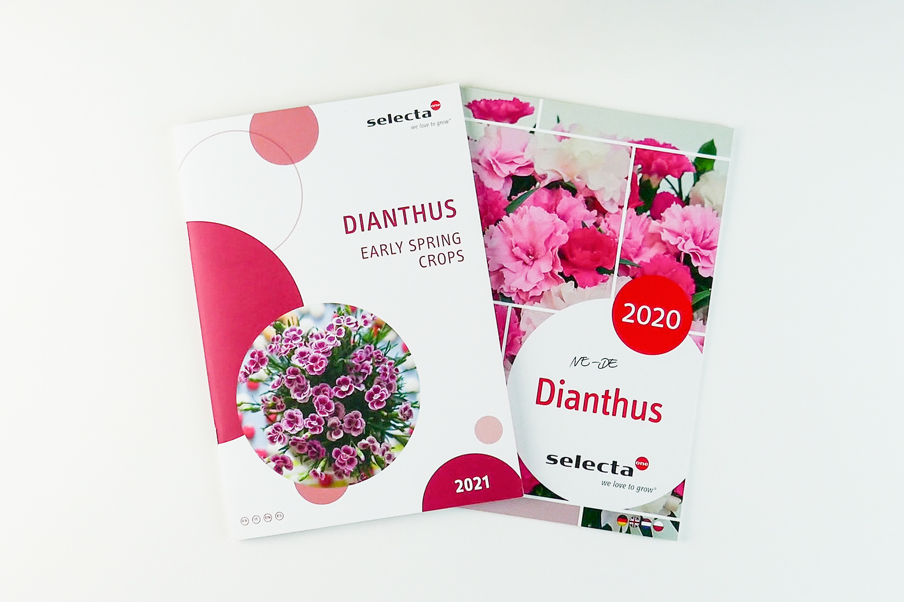
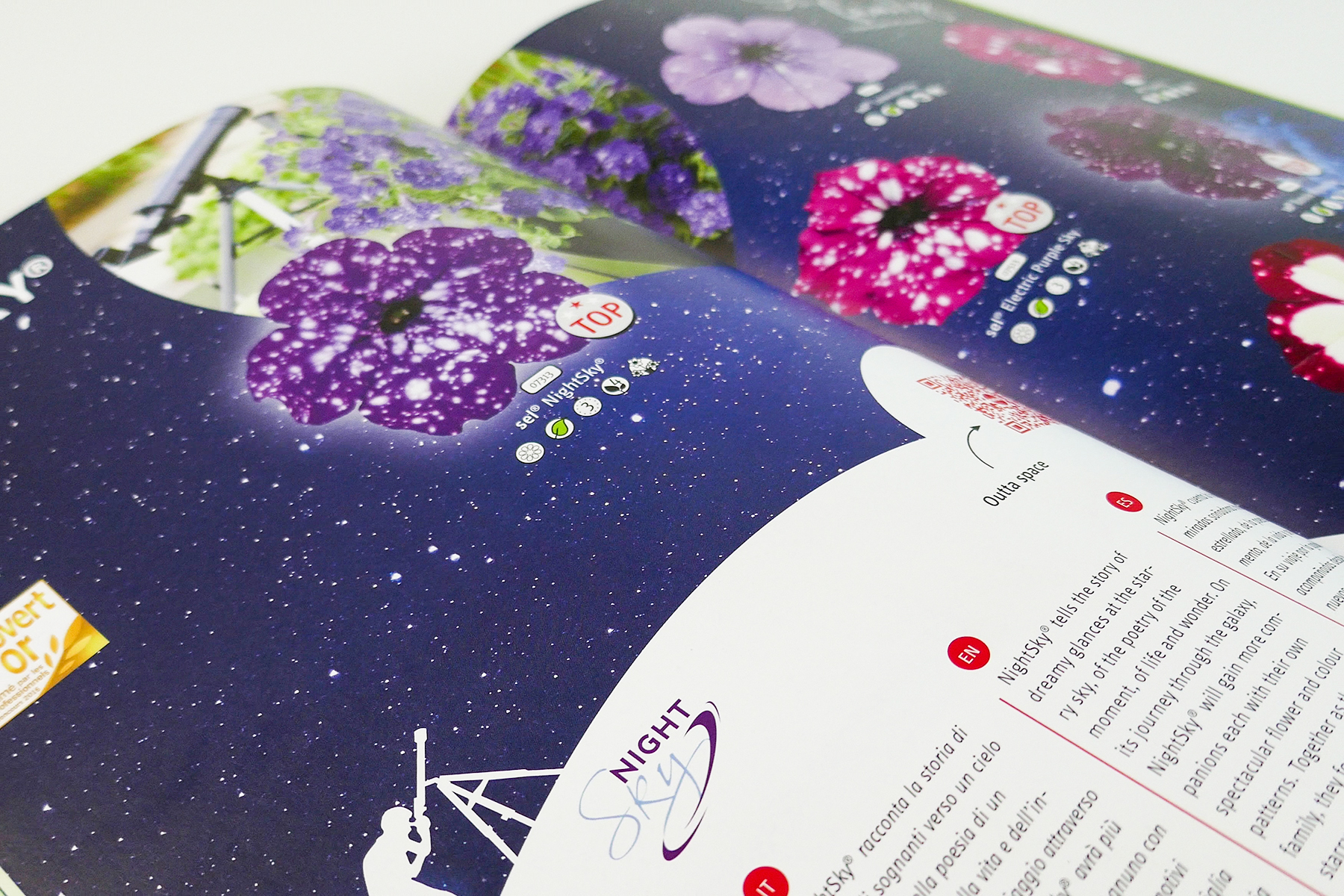
What stays? What changes? How much can a company change visually without losing its recognizability? Even with a "complete overhaul" project, we use familiar elements to ensure this recognition. The existing circular element, which is already known from the Selecta one brand core, was further emphasized and used across the catalog as a design feature. The logo, fonts, and pictograms are stylistic elements for future catalogs and ensure recognition.
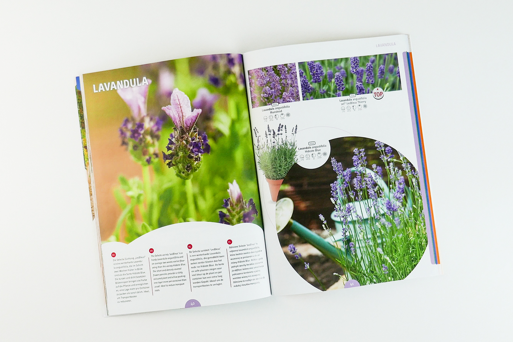
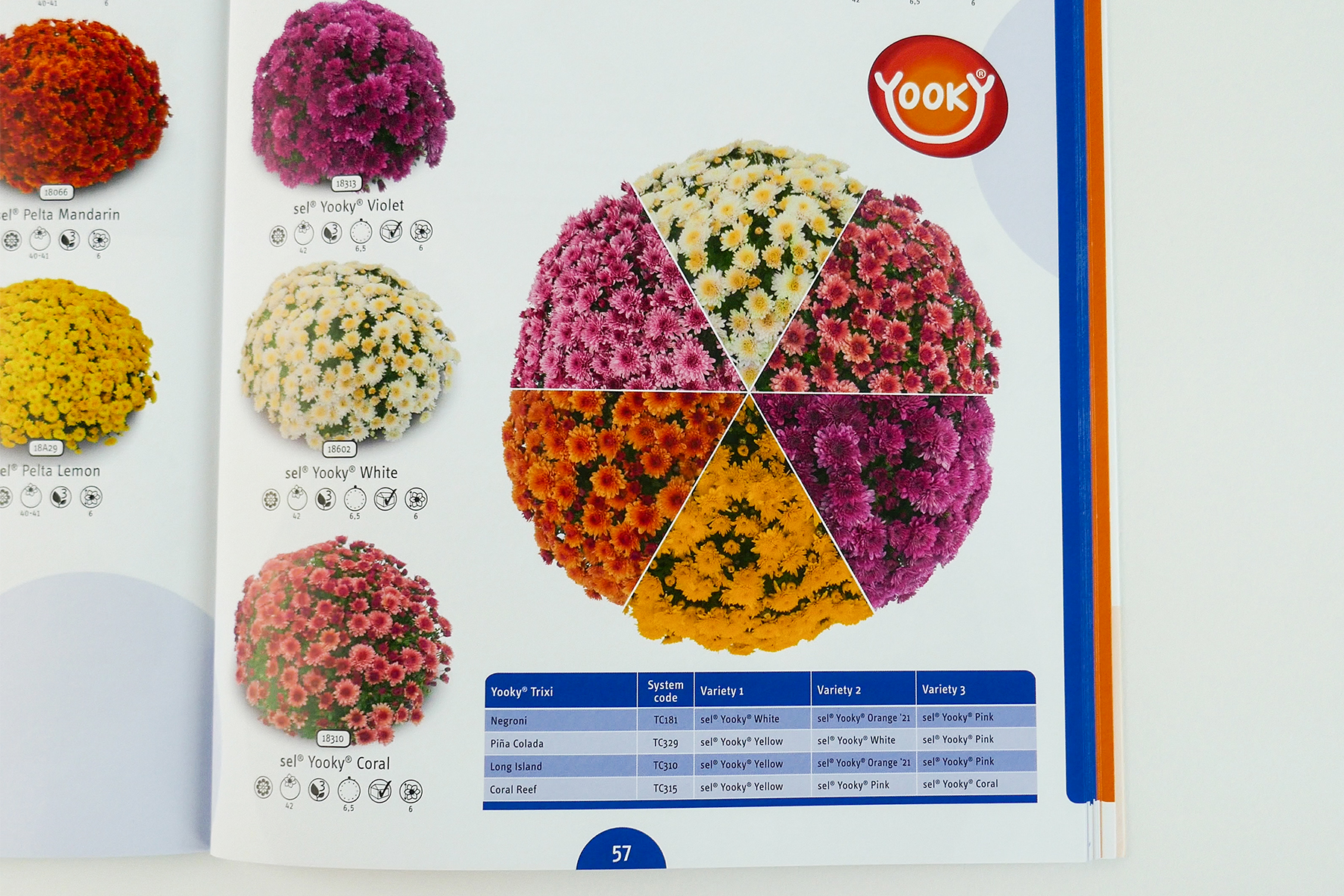
When it comes to page layouts, we opted for a completely new structure: By now loosely filling the pages with fewer products, images and the circle as a central element have more space to make an impact on the viewer. The majority of product images were isolated, allowing the products to stand out more. The resulting white space gives the eye the opportunity to navigate the page more easily. In areas with too much white space, we strategically used the circular elements to create interesting tension fields.
In collaboration with the Selecta team, the entire product range was re-categorized and given a color coding system: This color system, implemented as a tab in the margin, allows the reader to quickly identify which product ranges they can find where in the catalog. Even the smallest details, such as tables and pagination, were rethought and redesigned to improve the reading experience. Furthermore, whenever possible and appropriate, the Selecta experts have a voice in the catalog itself. To maintain a consistent visual language in the quotes, passport-style photos were deliberately avoided, and a botanical context was established so that the images were taken, for example, in the greenhouse. The Selecta’s Choice quote boxes were supplemented with QR codes linking to the Selecta website or YouTube channel.
And the final step 3: The big relaunch – construction and production
Once we had received the final approval from Selecta, the first catalog, "Dianthus," was created in the new look. Every single page was reconsidered, and the layout was revised once again. This meant a lot of work for our team, as well as for the Selecta team – work that was absolutely worthwhile, as everyone involved in the project was extremely satisfied with the result. This is also confirmed by Klaus Gaumann from Selecta himself:
,,With our long-standing communication partner Floramedia, we already implemented the second redesign of our catalog design in 2020. The first catalog from the new series has already been awarded the label 'Best Selecta Catalog Ever' by our global company. We are thrilled to have such a strong creative partner like Floramedia by our side and look forward to a successful future together!"
Klaus Gaumann, Head of Marketing Selecta One
We at Floramedia have nothing to add: We are also happy and proud of the great, long-standing collaboration. We look forward to all the future joint projects.
Looking for a new look for your catalog?

